File:Net migration rate world.PNG
Jump to navigation
Jump to search
Size of this preview: 800 × 351 pixels. Other resolutions: 320 × 140 pixels | 640 × 281 pixels | 1,425 × 625 pixels.
Original file (1,425 × 625 pixels, file size: 41 KB, MIME type: image/png)
Summary

|
File:Net Migration Rate.svg is a vector version of this file. It should be used in place of this PNG file when not inferior.
File:Net migration rate world.PNG → File:Net Migration Rate.svg
For more information, see Help:SVG. |
 |
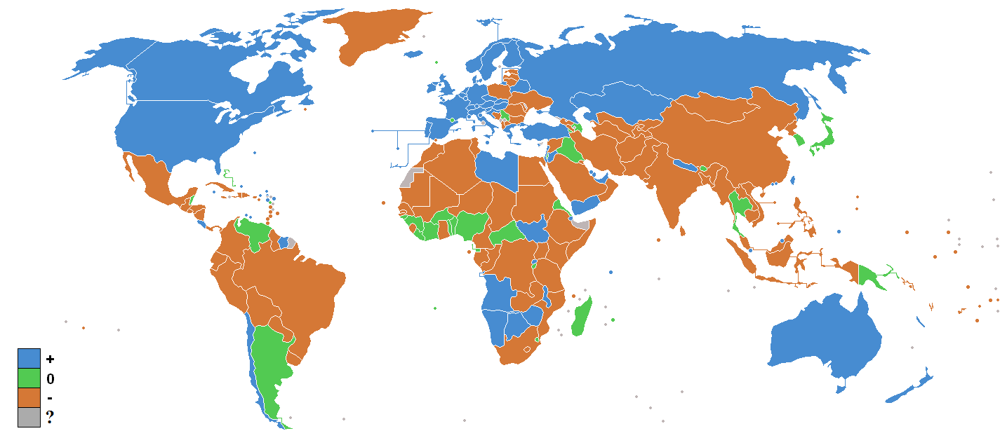
A map purporting to show the sign (positive or negative) of net migration rate by country. No source or date was specified by uploader , but the image was given a "2015 update" by one editor, so presumably it is based on some unspecified reference (perhaps the CIA World Factbook, as it was used before) from that year.
Licensing

|
Permission is granted to copy, distribute and/or modify this document under the terms of the GNU Free Documentation License, Version 1.2 or any later version published by the Free Software Foundation; with no Invariant Sections, no Front-Cover Texts, and no Back-Cover Texts. A copy of the license is included in the section entitled GNU Free Documentation License. |
| This file is licensed under the Creative Commons Attribution-Share Alike 3.0 Unported license. | ||
| ||
| This licensing tag was added to this file as part of the GFDL licensing update. |
File history
Click on a date/time to view the file as it appeared at that time.
| Date/Time | Thumbnail | Dimensions | User | Comment | |
|---|---|---|---|---|---|
| current | 01:52, 31 July 2015 | | 1,425 × 625 (41 KB) | wikimediacommons>Jamie Tubers | 2015 update |
File usage
There are no pages that use this file.